Color Your World
Color is more than a visual experience—it’s a language, a mood-setter, and a powerful tool that shapes how we feel, think, and even behave. From the clothes we wear to the spaces we inhabit, color silently influences our daily lives in ways we rarely stop to notice. When used intentionally, it can energize, calm, inspire, or even heal.
In this article, we’ll explore how you can truly “color your world”—not just aesthetically, but emotionally and psychologically. Whether you’re redesigning your home, refreshing your wardrobe, or simply trying to lift your mood, understanding color can help you make choices that align with the life you want to create.
Understanding the Psychology of Color
Color psychology is the study of how different hues affect human behavior and emotions. While cultural and personal experiences play a role, certain color responses are surprisingly universal.
Warm colors like red, orange, and yellow tend to evoke energy and excitement. Red, for example, can increase heart rate and stimulate appetite, which is why it’s often used in restaurants. Orange brings a sense of enthusiasm and creativity, while yellow is associated with happiness and optimism—though too much of it can feel overwhelming.
Cool colors such as blue, green, and purple generally have a calming effect. Blue is known for promoting focus and tranquility, making it ideal for workspaces. Green, often linked with nature, creates a sense of balance and renewal. Purple sits somewhere in between—combining the stability of blue and the energy of red—often associated with luxury and creativity.
Neutrals like white, black, gray, and beige might seem less exciting, but they play a crucial supporting role. White can symbolize cleanliness and simplicity, black adds sophistication and depth, while gray and beige provide balance and subtlety. Understanding how these colors interact allows you to build a palette that feels intentional rather than accidental.
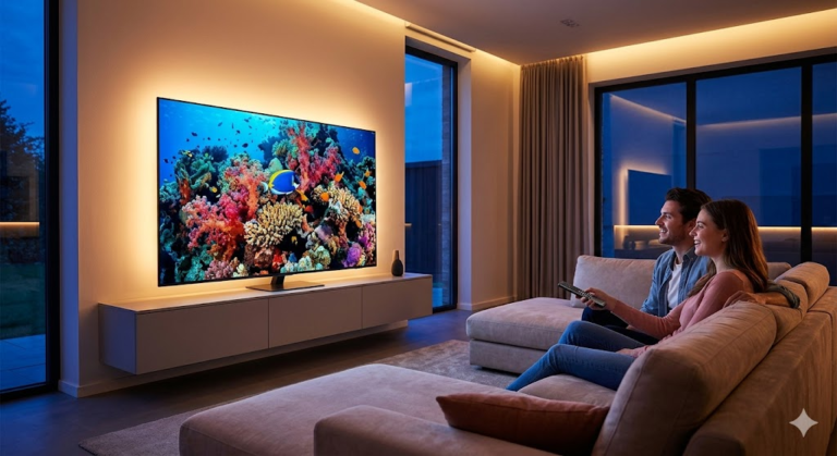
Bringing Color Into Your Living Space
Your home is one of the most powerful places to apply color intentionally. The right choices can transform not just how a room looks, but how it feels to live in.
Start by considering the purpose of each room. A bedroom, for instance, should promote rest and relaxation. Soft blues, muted greens, or warm neutrals can help create a calming environment. In contrast, a living room—where people gather and socialize—can benefit from warmer tones or bold accents that encourage conversation and energy.
Accent walls are a great way to experiment with color without overwhelming a space. A deep navy wall behind a bed or a rich terracotta tone in a dining area can add character while maintaining balance. Pairing these with neutral furniture ensures the space doesn’t feel chaotic.
Don’t forget about smaller details. Cushions, rugs, curtains, and artwork are low-commitment ways to introduce color. They can be easily swapped out as trends or your preferences change. Lighting also plays a huge role—natural light can soften bold colors, while artificial lighting can intensify or alter them entirely.
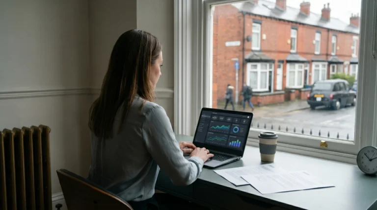
Using Color to Influence Mood and Productivity
Color isn’t just decorative—it’s functional. The hues around you can significantly impact your mental state and productivity levels.
If you’re working from home, consider incorporating shades that promote focus and efficiency. Blue is a strong choice for concentration, while green can reduce eye strain during long hours. Avoid overly bright or saturated colors in workspaces, as they can become distracting over time.
For creative environments, however, a bit of boldness can be beneficial. Splashes of orange or yellow can stimulate new ideas and keep energy levels high. Even a colorful piece of art or a vibrant desk accessory can make a difference.
In areas meant for relaxation, like reading corners or lounges, softer tones work best. Think pastels, earthy shades, or warm neutrals. These colors help signal to your brain that it’s time to unwind, making it easier to disconnect from stress.
The key is balance. Too much of any color—even a “good” one—can have the opposite effect. A well-designed space uses contrast and harmony to create an environment that supports your goals.
Expressing Yourself Through Color in Fashion
Your wardrobe is one of the most immediate and personal ways to “color your world.” The colors you wear can influence not only how others perceive you, but also how you feel about yourself.
Wearing bold colors like red or cobalt blue can boost confidence and make a strong impression. These shades naturally draw attention and can be especially effective in professional or social settings where you want to stand out.
On the other hand, softer tones like pastels or earthy hues can create a sense of approachability and calm. These are great for everyday wear or situations where you want to feel relaxed and grounded.
Understanding your skin tone can also help you choose colors that enhance your natural features. Warm undertones tend to pair well with earthy colors like olive, mustard, and rust, while cool undertones are complemented by jewel tones like emerald, sapphire, and plum.
Accessories offer an easy way to experiment. A bright scarf, colorful shoes, or a statement bag can add personality to an otherwise neutral outfit. Over time, you’ll develop a sense of what colors resonate with you and reflect your identity.
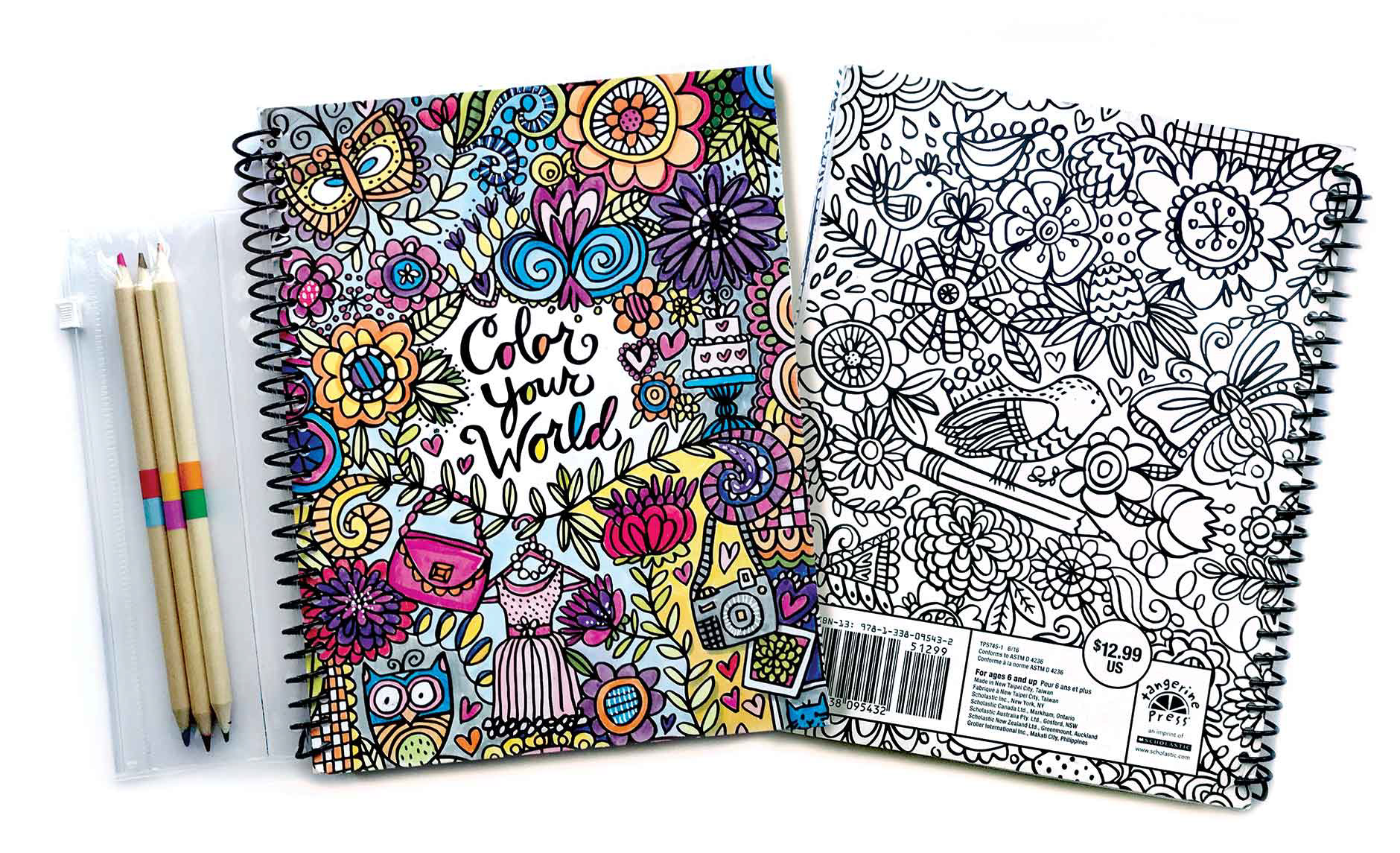
The Role of Color in Creativity and Art
Color has always been at the heart of artistic expression. Whether you’re a professional artist or simply enjoy creative hobbies, understanding color can elevate your work.
One of the most important concepts is color harmony—the way different colors interact with each other. Complementary colors (those opposite each other on the color wheel) create contrast and vibrancy, while analogous colors (those next to each other) produce a more cohesive and soothing effect.
Experimentation is key. Try limiting your palette to just a few colors and see how much variety you can create through mixing and shading. This not only improves your technical skills but also sharpens your eye for subtle differences.
Color can also be used symbolically. Artists often choose specific hues to convey emotions or themes. A painting dominated by dark tones might evoke mystery or sadness, while bright, saturated colors can express joy or chaos.
Even if you don’t consider yourself artistic, engaging with color creatively—through painting, photography, or design—can be incredibly fulfilling. It encourages mindfulness and allows you to see the world from a different perspective.
Incorporating Color Into Daily Life
You don’t need a major redesign or a new wardrobe to start using color more intentionally. Small, everyday choices can make a big impact.
Start with your morning routine. Something as simple as drinking coffee from a brightly colored mug or using vibrant stationery can set a positive tone for the day. These little moments of color can subtly influence your mood and mindset.
Nature is another powerful source of inspiration. Pay attention to the colors around you—the greens of trees, the blues of the sky, the changing hues of sunsets. Bringing elements of these natural palettes into your life can create a sense of connection and balance.
Digital spaces matter too. The wallpapers on your phone or computer, the themes of your apps, even the colors in your social media feeds all contribute to your overall environment. Choosing colors that feel uplifting rather than draining can make a noticeable difference over time.
Finally, don’t be afraid to change things up. Your relationship with color can evolve as your tastes and circumstances shift. What feels right today might not feel the same a year from now—and that’s perfectly okay.
Avoiding Common Mistakes With Color
While experimenting with color is encouraged, there are a few common pitfalls that can lead to less-than-ideal results.
One of the biggest mistakes is overloading a space or outfit with too many bold colors at once. This can create visual clutter and make it difficult for the eye to focus. Instead, choose one or two dominant colors and use others as accents.
Another issue is ignoring lighting conditions. A color that looks perfect in a store or online might appear completely different in your home. Always test samples in the actual environment before committing to a major change.
Consistency is also important. While variety adds interest, too many conflicting styles or palettes can feel disjointed. Aim for a cohesive look that still allows for personal expression.
Lastly, don’t follow trends blindly. Just because a color is popular doesn’t mean it’s right for you. The most successful use of color comes from understanding your own preferences and needs, rather than copying what’s currently in fashion.
Creating a Life Full of Color
To truly “color your world” is to approach life with intention and awareness. It’s about recognizing that the choices you make—no matter how small—contribute to your overall experience.
Color can be a tool for self-expression, a way to influence your emotions, and a means of creating environments that support your well-being. By understanding its impact and using it thoughtfully, you can design a life that feels more vibrant, balanced, and aligned with who you are.
There’s no single “correct” way to use color. What matters most is how it makes you feel. So experiment, take risks, and trust your instincts. Whether it’s a bold new wall color, a bright piece of clothing, or a simple change in your daily routine, each step brings you closer to a world that truly reflects you.
In the end, coloring your world isn’t just about aesthetics—it’s about living more fully, more consciously, and with a deeper appreciation for the beauty that surrounds you every day.